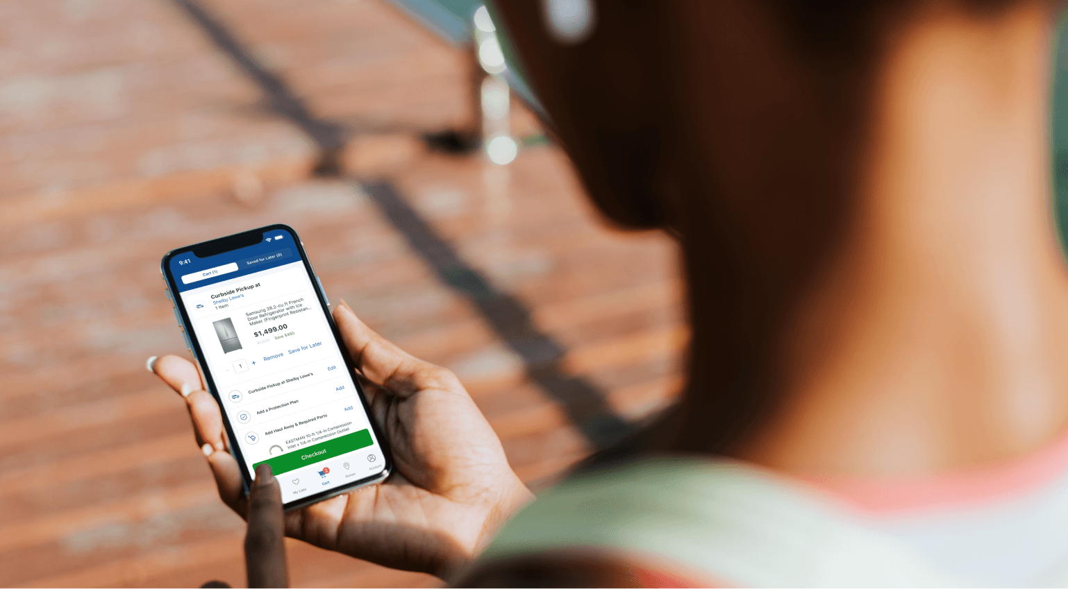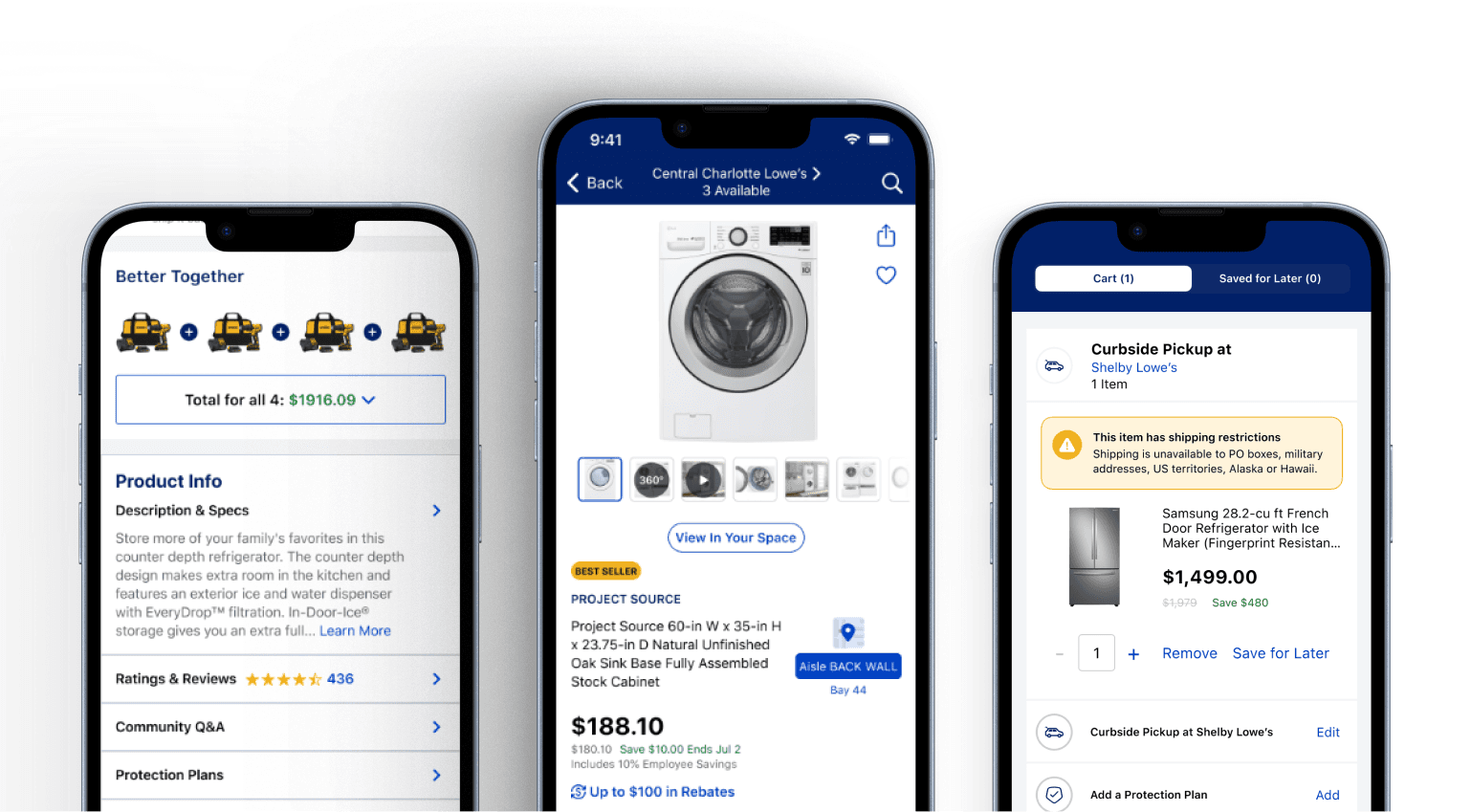
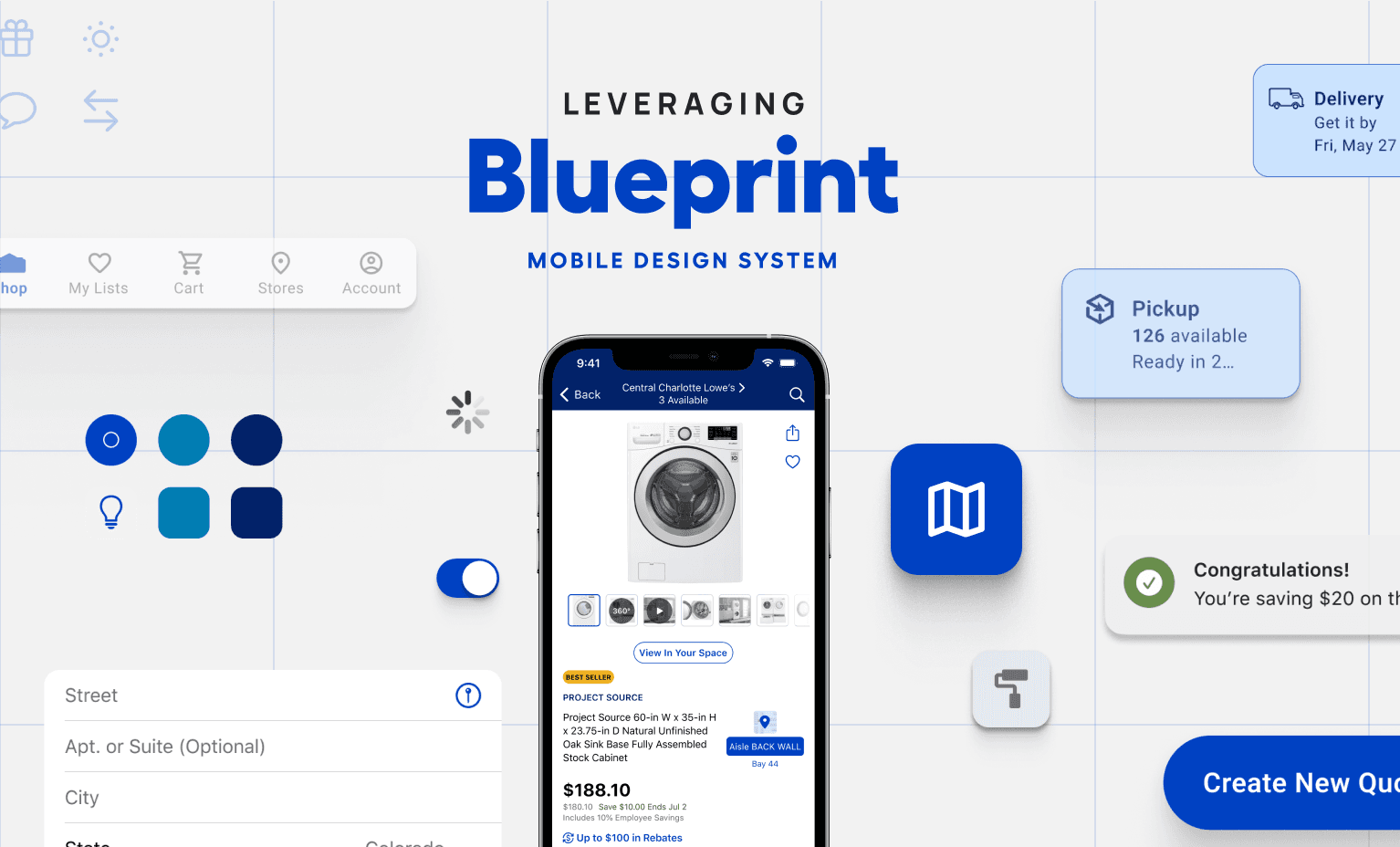
From fragmented to unified – Designing with Blueprint for consistency
We adopted Blueprint, Lowe’s internal design system, to bring structure and visual alignment across mobile screens. By translating web-first components into mobile-first patterns, we ensured the experience felt cohesive, intuitive, and brand-aligned at every step.
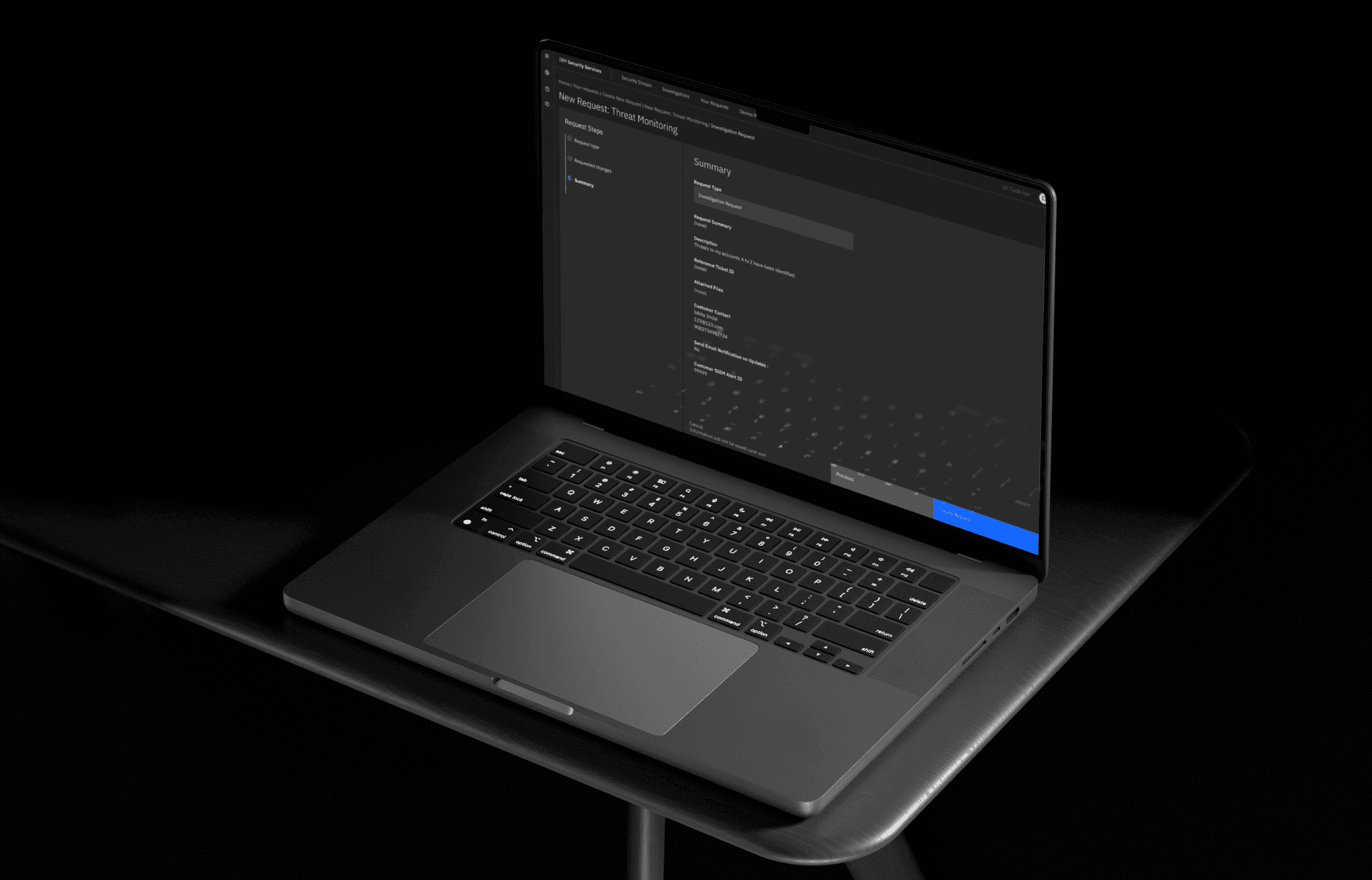
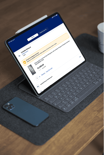
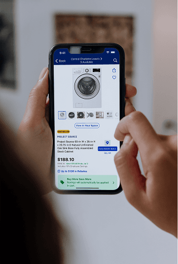
Designing for every mode, every screen
We created responsive designs for both phone and tablet, optimized for light and dark modes. Once development was complete, we conducted post-release testing to ensure the experience remained seamless, accessible, and visually consistent across devices.